More Colors than the Rainbow: Window Treatments Go Neutral, Bold, Bright & Beautiful
The furniture is in place; the walls have been painted. You’ve decided on drapes in the living room and privacy window film for the kitchen. How do you tie it all together? Color! Interior designers know that the interaction of color sets the stage for emotion—from efficiency, comfort, playfulness and friendliness to serenity and safety. But what if you’re not a designer? Do you have to follow the rules that your mother used? Must you rely on the privacy window film stocked at the local home improvement store? Who says red and yellow don’t go together? Fear not – with a little research, a not-too-rigid game plan and a bit of creativity, you can integrate designer tricks into your window treatment choices.
Most often, when we think of color choices, we are thinking of walls and furniture. However, window treatments come in such a variety of colors, textures, and patterns that they deserve a seat at the color table. Let’s chat about how you can use colors to create your look.
Color 101
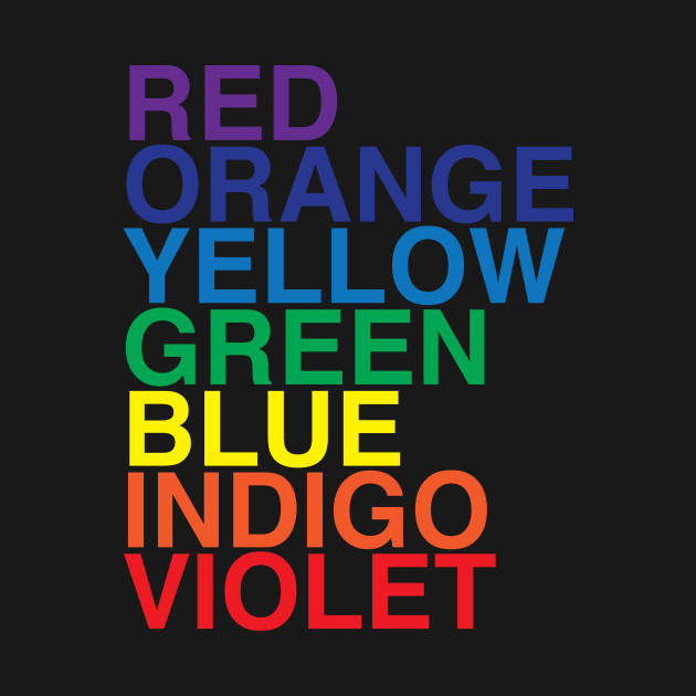
How many of us remember ROYGBIV? We learned that rainbows, and all color for that matter, are made of Red, Orange, Yellow, Green, Blue, Indigo and Violet. A designer’s color wheel, a wonderful tool, consists of 12 colors:
- Primary: Red, blue, yellow
- Secondary: Orange, purple, green
- Tertiary: Six shades that result from mixing primary and secondary colors
But there’s more. Pantone Matching System (PMS) is the company best known for providing proprietary color to a variety of industries, including print, paint, fabric, plastic and film like that used in privacy window film.
And don’t forget the non-color colors
- Black
- White
- Clear
By experimenting with a color wheel, you can see how your new colors will play with the existing or new color scheme in your space.
Pick a favorite
Blue like the ocean, green like the forest, yellow like the sun – for most of us, it’s an easy question. But, choosing a color for your window treatments is about so much more than just what you like. The choice should include the mood you want to craft and the intent of the space.
Ask yourself a few questions:
Should this room feel cool or warm?
When I am in this room, what do I want to feel (i.e., energized, peaceful, efficient, restful, etc.)?
Am I changing the use of this room?
Will the room reflect my personality?
Do I want patterns, solids or textures?
Will texture affect my color choices?
Are there any colors that I love? Or hate?
Will I like my choices 2 years from today?

Answering these questions, and some you’ll think of, will help you with your color palette choices. And head to magazines and the internet; clip or pin pictures that inspire you.
Pick a temperature
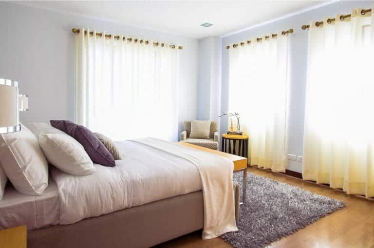
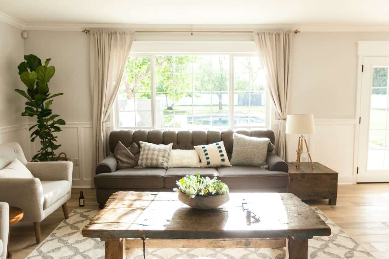
Go cool with greens and blues. These colors work well to create calm surroundings. Window treatments in this color spectrum are soothing and work particularly well in bedrooms and kids’ playrooms.
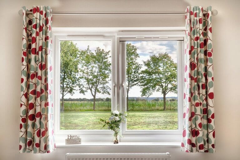
Sizzle with red, orange or yellow. Using these colors add pop to a neutral room or a sense of heat to a cooler room. Warm colors can make a room feel intimate; this is one reason that warm colored window treatments work so well. They provide a bright burst of color without overwhelming a space and making it feel cramped.
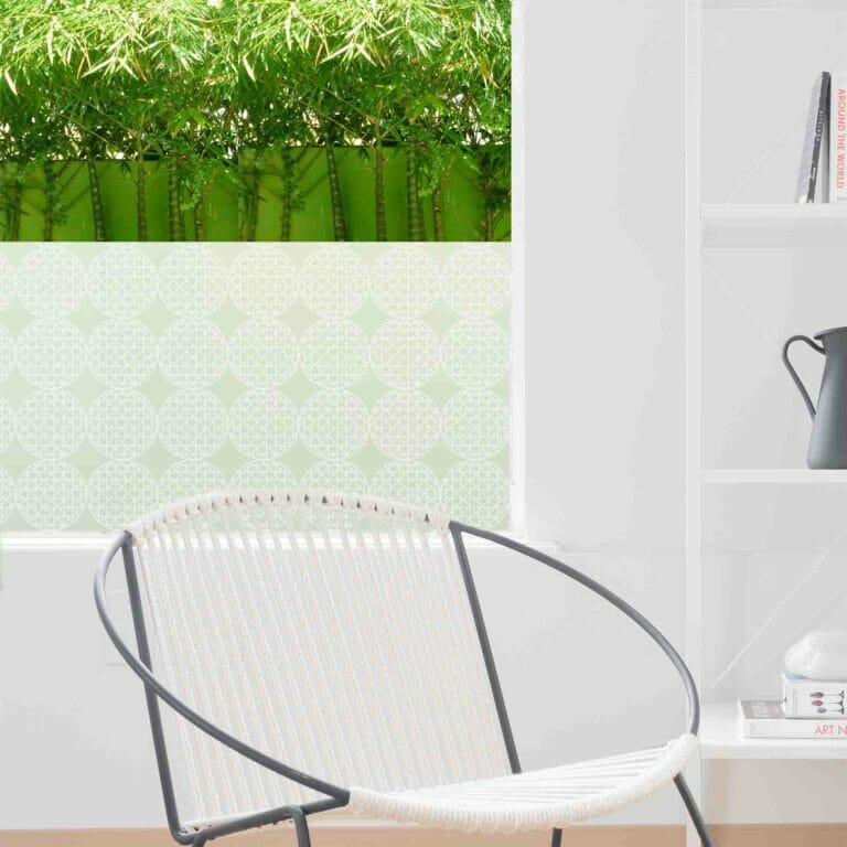
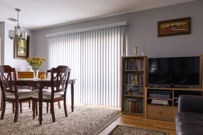
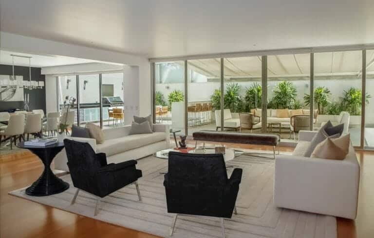
Anything but boring is the neutral color palette. Whites, beiges, tans and taupes aren’t ostentatious; their lack of fussiness allows other colors and patterns in the room to shine. In a neutral room, choosing neutral window treatments adds a layered, textured feeling to the space. Or choose the road to bold – brightly colored or patterned treatments for drapes or privacy window film will command center stage in the room.
Fashionistas know the need for the perfect LBD (little black dress). The same holds true for black in window treatments. Black can turn up the volume in a room; creating an entirely new energy. Privacy window film with a striking ebony pattern demands attention. Charcoal shutters can create a crisp architectural line. Black adds texture, is both modern and classic and is sure to make a statement.
***
Spend some time thinking about your ideal colors, textures and patterns and how you want them to interact in your space. Order swatches, samples, patches, etc. Today’s window treatments have it all!